| "Tekken 4 Christie" Reviews/Comments [ 6 ] | Title: Fan---A.R.G. Me
Reviewed By: Fanilia [MediaMiner Member] On: October 06, 2002 10:12
Comment/Review:
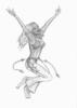
Very nice. The shading is great and the proportions are close. Her lips do seem to be a little oversized though. And I wouldnt end the hair in clumps since she seems to be in motion.
Keep it up your getting that real look in there. | Title: ARG
Reviewed By: Dark Dasha [MediaMiner Member] On: October 05, 2002 06:11
Comment/Review:
Yah, I agree with evrybody..Theres juts one more thing that really catches my eye... Her right(my left) armpit is kinda weird... It just doesnt seem possible for an arm to twist that way.. | Title: ARG
Reviewed By: Meghanna_Starsong [MediaMiner Member] On: October 05, 2002 00:11
Comment/Review:
okay, the shading is good, as is the lower body, clothing...hair. the expression on the face is neat, and so is the detail in the muscle structure. however, her arms are too thin in proportion to her body. the forearms need to have a bit more 'meat' on them...not quite so skinny. also her right hand (my right) is off... but this is a very interesting picture...symbolic in a sense. *applauds* kudos! keep up the good work. | Title: ARG
Reviewed By: Dan1 [MediaMiner Member] On: October 04, 2002 23:48
Comment/Review:
the other guys did most of the observations for me, so i'll just get to what catches my eye.
You need more work on the shading, the image almost looks monotone, too flat. you need more variation and a bit of practice with shadows and light. | Title: ARG
Reviewed By: SunnyLin [MediaMiner Member] On: October 04, 2002 22:24
Comment/Review:
good attempt to realism. its a nice mix. a few things i would fix: her left wrist is way too narrow and maybe her fingers could be a bit longer, i would make her hair a bit less blocklike, give her some strays, no one's perfect ^.-, and i think the left foot is twisted a bit too much toward teh viewer, it doesnt seem possible to be able to support all of her weight on those toes, if she's jumping, then her foot should be stretched out a bit more, less flat and less parallel to the assumed horizon line (bottom of the page). this is a great interesting pose, i would love to see a horizon line and some shadows. great job | Title: Arg
Reviewed By: Destiny [MediaMiner Member] On: October 04, 2002 22:16
Comment/Review:
Very nice however her hair is a bit too stiff to be seen as realism and her lips are a bit to large in proportion to the rest of her face. Nice work with the shading and pose also the fingers are a bit to sharp at the tips, fingers tend to be more rounded at the tip. Overall very nicely done. Destiny |
|