| "Aeon Flux: Ready for you, Danger Boy" Reviews/Comments [ 13 ] | Title: "How Dare You Dare You Danger Boy"
Reviewed By: sephlier (not logged in) On: February 17, 2004 17:51
Rating(s):Originality/Creativity: 10 of 10
Drawing Skill: 10 of 10
Use of Medium: 10 of 10
Overall Rating: 10 of 10
Comment/Review:
*I know this review is extremely late...you've had this pic up for a couple years* I AM SO HAPPY YOU WON A SPOT FOR IT ^_^ CONGRATULATIONS!!! I was browsing fanart on this site back in January. I hope you don't mind but I added it to "my pictures" folder so I can view it as part of my screensaver. I don't have it on any sites or anything like that. I ABSOLUTELY LOVE AEON FLUX!!! Do you have any more art of her? You kept up with Peter Chung's style so everything looks in proportion. Uhmm...I'm sorry to say this and this comment might encure wrath from other reviewers but OH WELL, Aeon Flux was not meant to be the prettiest woman in the world. The artist (I have Heroditus File on my coffee table) did not mean for her to be. He's a fan of exageration. You did an excellent job on her!!! I have not seen any other fanart of her. I love your title too ^_^ Thank you sooo much for bringing her back into the light!!!!!!!!!
| Reviewed By: zombi3d [MediaMiner Member] On: October 25, 2002 22:02
Comment/Review:
this is awesome
the pose
the shading
everything!
but i think the REAL char is older.. and more crooked.. and bent and stuff
i think
right?
hehe
good job on the bg
simple, but effective!
maybe her right boob is a bit off
but thats it
good job!
A.R.G. | Title: ARG
Reviewed By: Meghanna_Starsong [MediaMiner Member] On: October 21, 2002 19:43
Comment/Review:
what really needs to be fixed in this picture is to lengthen out the legs right below the knee. usually a leg flows from the knee, down into a fleshy curve and then to the calf muscle. also....more detail on her hair! it's neat, really, sophisticated...but it lacks 3d qualities. now...I LOVE THE WHOLE IDEA OF THIS PICTURE! @.@ oh my goodness...that's so freaking kewl! valkyrie! valkyrie! *waves arms around* neato outfit, and the blood..and yeah. *coughs* anyway, great job! | Title: ARG
Reviewed By: SunnyLin [MediaMiner Member] On: October 20, 2002 20:13
Comment/Review:
anatomy problem? i don tthink there's a a big one. the only thing that i might see would be the legs, i would personaly make them longer, its an anime thing. the GUN well that's BIG. really big. but it looks cool. i must say though it doesnt match the seriousness of the rest of the character. the only things that iw oudl change would be to fix up the face an dhair. her face is pretty darn ugly. ehh.. i think her face lift was a ltitle too high. her eyes are unexpressive and her eyebrows are really really big. unless she's balding, her hair line is also too far back. i would also add mroe stray hairs in order to make her head look more real. right now she kinda looks like a lego with plastic hair and a plastic face with a tongue sticking out. dont be afraid to giver her face personality, you did it soo ingeniously wiht the body. great job! haha i love the caption | Title: ARG!
Reviewed By: bratkitty [MediaMiner Member] On: October 19, 2002 21:39
Comment/Review:
Whenever you do something in black, make sure you add lots of highlights to define things better. It gets a little obscure in some parts here. It will help with the anatomy too. The anatomy overall looks really good. Her left ankle is a little thin though and the calf is a little high. It may be because of the black, but the realtionship betwen the shoulders and breasts look a little detatched but I can't tell for sure. The skin tones look really good. Very nice for a refereence. Great job! | Title: Arg
Reviewed By: Destiny [MediaMiner Member] On: October 19, 2002 20:33
Comment/Review:
Very nicely done, wonderful job on the highlights and shadows. As well as the different values of intensity in color. And since you have already mentioned the thing about the hips I won't become redundent. Really nice job with the provacative yet playful pose. | Reviewed By: Afuna [MediaMiner Member] On: October 19, 2002 20:18
Comment/Review:
Ok then ^_^ She is sort of nice-looking, if in a rather severe kind of way. Thanks for the quick explanation :D | Title: ARG review
Reviewed By: Ralloonx [MediaMiner Member] On: October 19, 2002 13:10
Comment/Review:
You're asking anatomical advice for a picture in a series that is known for ignoring the anatomical? o.o *laugh!* You are drawing the wrong series for anything like that. The picture itself has a really nice balance of blacks, and the skin tones and shading are lovely. Beyond the one foot being truly.. strange, I don't have anything to suggest really. | Title: Fan---A.R.G. Me
Reviewed By: Fanilia [MediaMiner Member] On: October 19, 2002 13:01
Comment/Review:
The shadows and everything are really good in this piece. I haven't seen the series but your additional comments in the review section helped alot. I think that outlining the tongue in a browner or rust hue would make it more defined from the lips. And I'd really like to see a smoke effect from the gun, but thats just me. Overall the piece is great and I hope you post the colored pencil study of this. | Reviewed By: Komodo Dragon [MediaMiner Member] On: October 19, 2002 12:33
Comment/Review:
Nice one! I love the way you coloured this in! The shadows/highlights on both her clothes and flesh is nicely done. Few things though. Her ankle...it sticks out *too* much. Her thighs are waaaay too big. The length is ok...its just the width ^_^;. Also, her mouth. I cant quite make out what that 'light' spot is. If its a highlight then you made her mouth uneven [one side bigger than the other]. If its her tongue, then you need to make that a little clearer. Thats it ~ overall, great piece! \~A.R.G.~/ | Reviewed By: corynth [MediaMiner Member] On: October 19, 2002 10:53
Comment/Review:
Thanks for the comments. :)
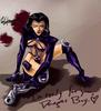
The Aeon Flux style of characters are typically very broad shouldered with prominent ribcages, extremely thin waists, and (for women) hips that aren't quite as big as the shoulders. She has a very angular, sharp face that usually has tons of expressive, angry wrinkles, too long eyebrows, and a very thin nose.
The hips/connection between the legs and the waist is a part that I'm going to try to fix up for the colored pencil. | Reviewed By: Afuna [MediaMiner Member] On: October 19, 2002 04:38
Comment/Review:
Good job here.
I haven't seen the series so I'm afraid that I can't comment on this in relation to the original looks of character, but the shading is _good_.
Some lines seem wobbly (her left/our right leg is a case in point) and her cheekbones seem just a tad too sharp.
Good pose you've put her in (although I wouldn't even think of trying it out myself, unfit real life body and all that o.O), and the foreshortening seems to be all right.
Hm.. I seem to be having a bit of a hard time trying to figure out the portion near her left(our right) hip and the waist. If I'm seeing it correctly, the waist seems to be too small, and the thigh terrifyingly humongous.
Unless, of course that's just a quirk of a character design that I, unfortunately, have not had the chance to see. (*grins sheepishly* So many shows, so little time.. )
The eyes seem just a bit uneven at their top (her right eye being a bit flat and her left eye being just a bit more rounded) and her eyebrows just a bit too angular (and again, I apologize if this is her original character design I'm nitpicking about )
Good use of background, as well as shadows and contrast. And -- I think that I can't mention this enough-- fantastic shading.
Good luck to you in your next drawings ^_^ | Reviewed By: SykoPants [MediaMiner Member] On: October 19, 2002 03:09
Comment/Review:
aw dude this rocks!!!! im very angry they stopped showing aeon flux on mtv, but from wat i can remember of it, the way u drew her looks like an exact replica of her from the series! amazing how u did the shading so well too! and i like ho the perception of the writing on the bottom was done. luvly picture! |
|