| "Hush" Reviews/Comments [ 8 ] |
Reviewed By: Jana-chan [MediaMiner Member] On: November 14, 2002 14:42
Comment/Review:
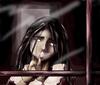
*screams and runs away from the scary girl* Ooh, you did a beautiful job here, corynth.. |
Title: ARG!
Reviewed By: bratkitty [MediaMiner Member] On: November 06, 2002 21:33
Comment/Review:
This one looks much better...The highlights still look a little random. If she's not supposed to have pupils, then maybe darken the white a little. Otherwise it looks great. |
Title: ARG
Reviewed By: Meghanna_Starsong [MediaMiner Member] On: November 06, 2002 20:47
Comment/Review:
wow...shaping up nicely. you did alot better on the hair...good colors. she still needs pupils..and irises! freaky...nice colors....good general tone...i like it! |
Title: A.R.G.
Reviewed By: Kaden Fukuyama [MediaMiner Member] On: November 06, 2002 08:02
Comment/Review:
Since I really don't know how to critique this one *it looks so good* all I can say is I agree with Ralloon, maybe you should thicken the outline of the finger a bit. It is really creepy though. I like it allot. |
Reviewed By: SykoPants [MediaMiner Member] On: November 06, 2002 02:35
Comment/Review:
oh god this is creepy. i'm gonna have nightmares about this one! well the colors u used r excellent! they compliment the pic so well! as for her hand, i would fix the shading there cuz the lower part looks like it's bulging out when there should b signs of it sinking in where the palm is. also, the way u colored in the hair makes it look kinda weird, i would lose the random white streaks, instead highlight using the same color u used to highlight the hair in the front on the ryte side of her head. this pic is terrific, especially the shadows dont on her face! the colors u used r magnificent! |
Title: Arg
Reviewed By: Destiny [MediaMiner Member] On: November 05, 2002 18:32
Comment/Review:
Okay this one is definately spookier than the last. Excellently done however work on the palm of her hand a bit, it looks off proportion. Also maybe dimming down the hair highlights a tad it looks like she has gray hairs rather than those being highlights unless this was done intentionally. Marvelous work with the dramatic shadow and color sheme, overall excellently done. Destiny |
Title: ARG
Reviewed By: SunnyLin [MediaMiner Member] On: November 05, 2002 17:40
Comment/Review:
ah.. this is the definition of spooky. nice! i'm guiessing you stil want some improvements so i'll mention some tiny things. 1, i would make the collar and the door a little darker, it doesnt blend too well with the tone of the rest of the picture. i would also do some work on her hand. it looks as though her palm is swollen aan dher fingers were cut off and shifted over to the right. this is realy amazing. i can see some definite hard work was put into this. wow! :) |
Title: ARG review
Reviewed By: Ralloonx [MediaMiner Member] On: November 05, 2002 15:53
Comment/Review:
I really liked the first one, and for all it's the same image technically this one has a different feel. Nicely done. :) The only thing I would suggest is to go in and make a thick outline of the finger on the window, and some of that hand. This is to help suggest that the finger is closer to us than the face. |